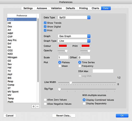
If the data type is displayed in the Preference list, select it to edit it.
If it is not, you can add it by clicking the + button and choosing the Data Type in the popup.

The list is shown in reverse order of how the data types are displayed on the screen. In the above example, Desflurane is plotted after the Arterial pressure, and will be displayed on top of it. If you want to change the order, select the name of the data type in the Preference list, and type Command Arrow Up to go upwards or Command Arrow Down to go downwards.
Alternatively, you can change the opacity slider to allow traces behind the data to be seen.
You can choose how data are displayed in Preferences -> Data
Editing Data Types
Show Trends displays the data on screen. Show Digital displays the latest data in digital format when recording. Print displays the data when printing.
The Graph popup allows you to choose which graph to display the data on. Graph Type allows you to select how you want the data to be displayed.
Changing Order of Plotting
Determining Where And How Data Is Plotted
Determining Appearance of Data
You can select separate colours for display or printing.
Monitor plots airway pressure graphs as a bar with a white dot in the middle. You can select here whether the dot refers to the Plateau or the Mean Pressure.
The default is to display data as a time series. You can instead display it as a density modulated spectral array by choosing the Frequency radio button. You might want to do this, for example, to look for changes in heart rate variability.
The Line Width slider changes the width of line graphs. Sig Figs changes the number of significant figures on the digital chart.
Changing Scale
Scale and Offset can be used to allow data to be plotted on a graph at a suitable scale. In the example above, Desflurane is plotted at 10 times the actual concentration on the Haemodynamic Graph.
Allow Zero Values or Allow Negative Values should be checked if the data can reasonably be expected to be zero or negative.
Handling Multiple Data Sources
The multiple sources choice determines whether two methods of measuring the same parameter are plotted separately or as fused data. For example, the heart rate from the oximeter and the ECG. At the moment, all data is plotted as fused.